

Project — Branding, 2024
RevDoc
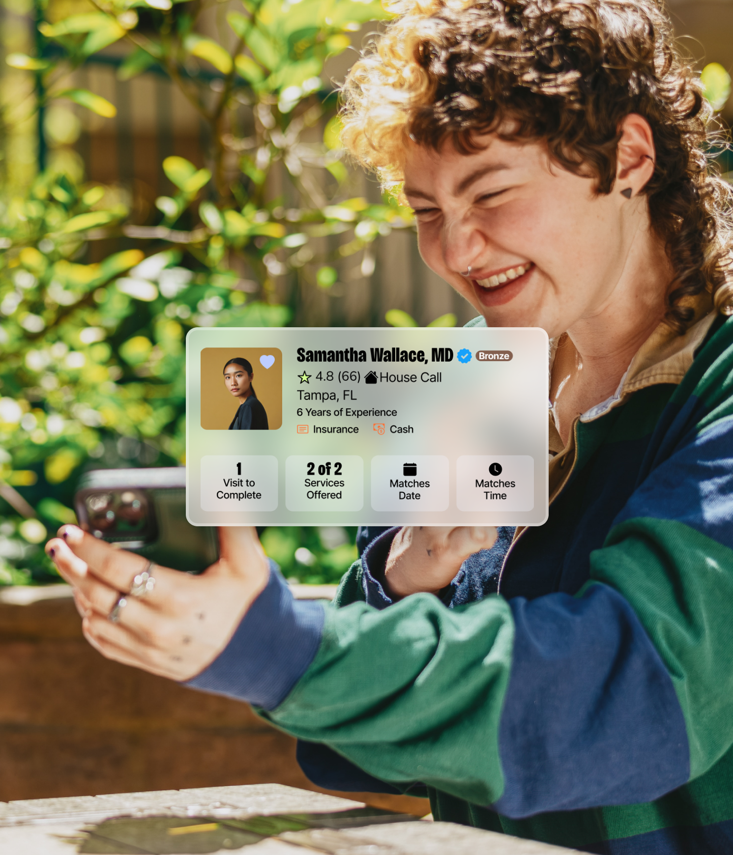
A first-of-it's-kind app where you can schedule a doctor to come to your door.
Client
On-demand Healthcare
MY ROLE
AD & Brand Design
RevDoc
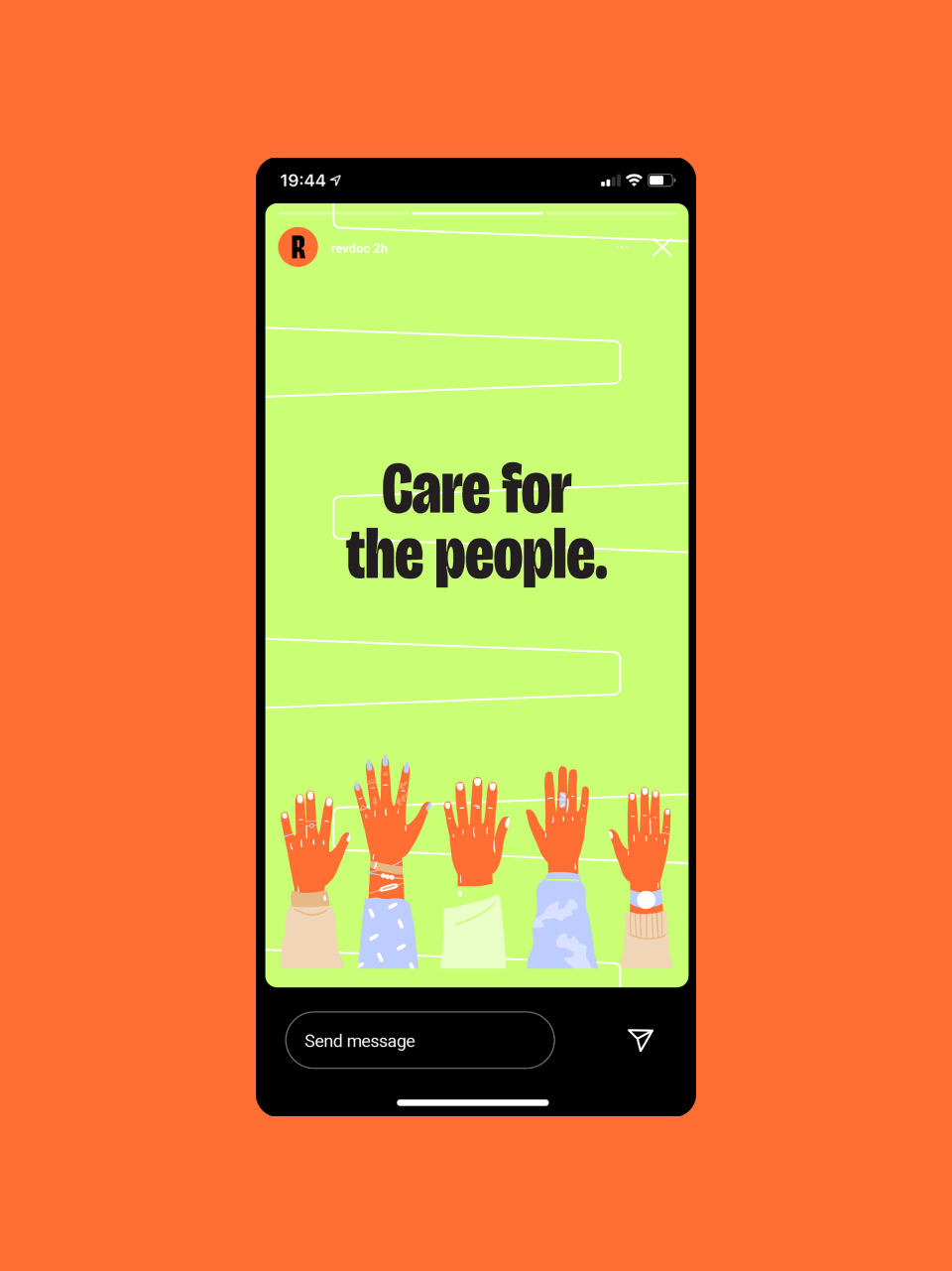
Care for the people.
Care for the people.
RevDoc frees people from ever-escalating insurance costs and difficulty accessing quality care.

The Challenge
Amid an industry clouded by skepticism, RevDoc needed a brand identity that could earn trust while signaling genuine innovation. The primary challenge was to evoke the fervor of change and a sense of urgency without stirring negative emotions like anger or fear. We needed to develop a solution that could confidently attract early adopters by visually communicating a practical movement for a new type of healthcare delivery.
The Solution
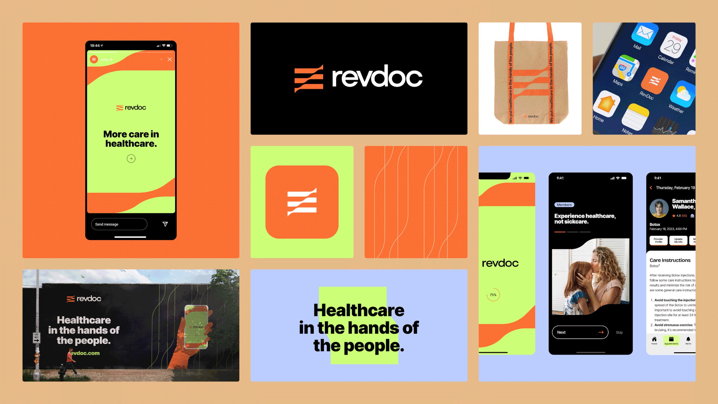
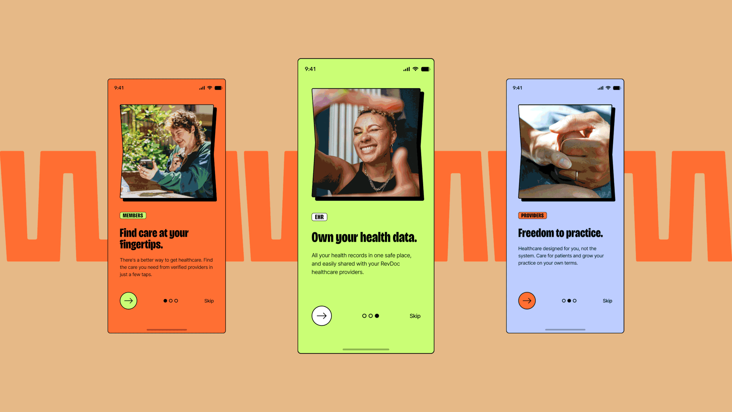
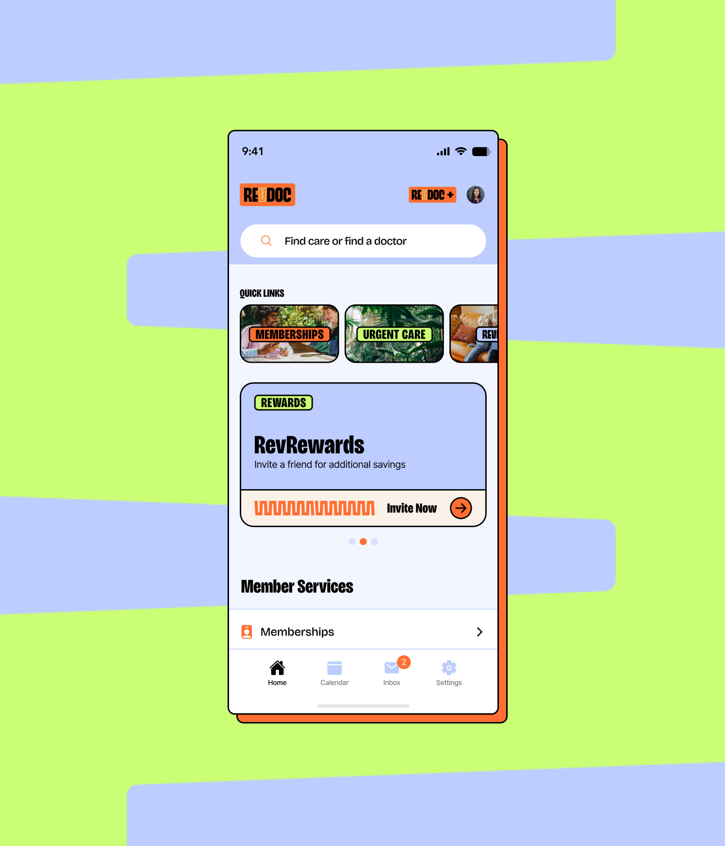
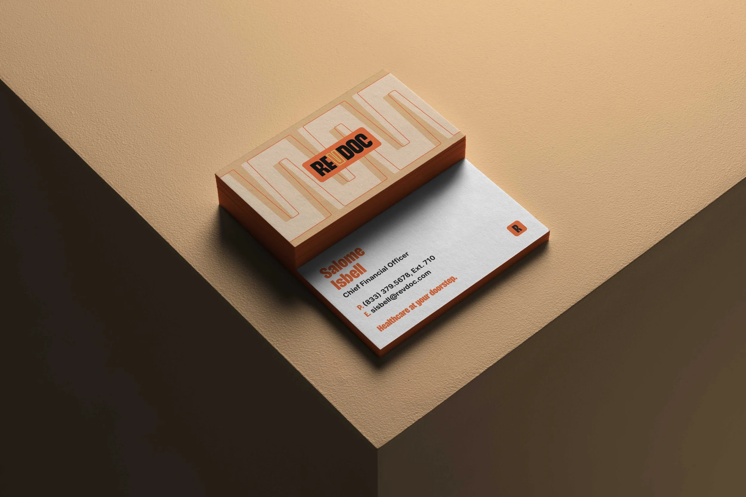
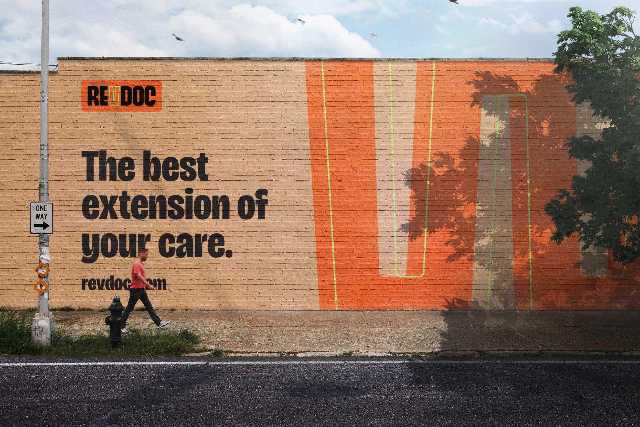
To convey a fresh and revolutionary take on healthcare, the visual design for RevDoc was built on two core concepts: nostalgia and human touch. Symbolizing “power in the hands of the people” was achieved through the use of full-color reportage photography, celebrating genuine moments and a sense of belonging. The color palette is anchored by an enthusiastic orange to project energy and optimism, while bold, uppercase sans-serif typography delivers a direct and empowering message.
Unpack the design decisions that bring this vision to life in the sections that follow…
Results
Since launch, RevDoc has reinforced its position as a modern healthcare provider by expanding into veterinary care with RevPets and rolling out tiered memberships and employer health benefit programs.
MY ROLE
Art Director at C42D
Art Direction
Brand Design
Engaged with the whole project cycle, I worked closely with the strategy team during the strategy phase before fully taking over brand design and brand guidelines. I then oversaw applications of the brand as well as website design. As the voice of the brand, I presented all concepts and led internal critiques to refine and elevate the project.
THE TEAM
Brand Strategy Clinton Barnes, The Connected Agency
Copywriting: Robyn Stubbs
Digital Design: TJ Knight, C42D


Egalitarian / All American
Audience
RevDoc is for the mass market; everyone has a price point that suits them whether they’re working class, middle class, or high-income Americans.
Moodboard

Empowerment Confidence Efficiency Enthusiasm
RevDoc rejects the cold, fragmented feel of America’s current healthcare system and instead places people at the center. The brand embodies care that is accessible, stripping away unnecessary complexity to focus on what truly matters. Black and white ground the system in directness, while vibrant bursts of color spark energy and progress. Authentic, full-color photography preserves every hue and shade, capturing the vivid spectrum of real life and the communities it serves. Bold typography and geometric graphics amplify their message with urgency, transforming each design choice into a rallying cry for change.
Care for the people.

An act of defiance, RevDoc is raising a banner to say proudly that we’re not going to take it anymore. We find community in our shared identity of people who simply want better care.

RevDoc is a movement in action, making it’s impact felt on all those it touches. It is flying its flag proudly, hoisted in the high wind to challenge people into rethinking sickcare as healthcare.

RevDoc is a firework of excitement shining bright as a new way forward. Different stars shapes show how we are a constellation—a community of different people—coming together to replace sickcare with healthcare.


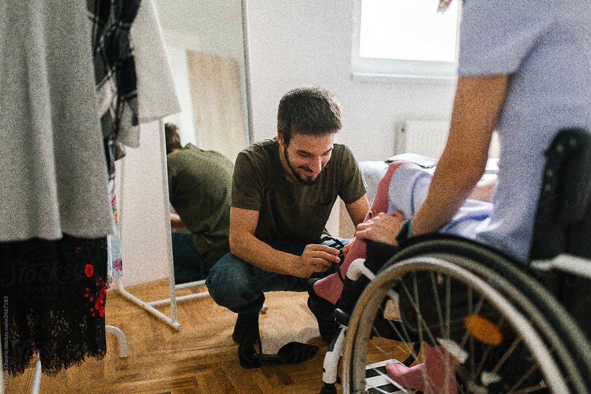


Photography
Full-color photography captures authenticity by faithfully representing the vivid spectrum of real life. By preserving every hue and shade a truthful portrayal of individuals and their communities emerge. This richness of color adds depth, allowing the viewer to immerse themselves in the genuine emotions and unembellished moments and enables a holistic view of life’s intricacies. A slight grain is applied to create a consistent look across the brand and hints at a nostalgia of simpler times.

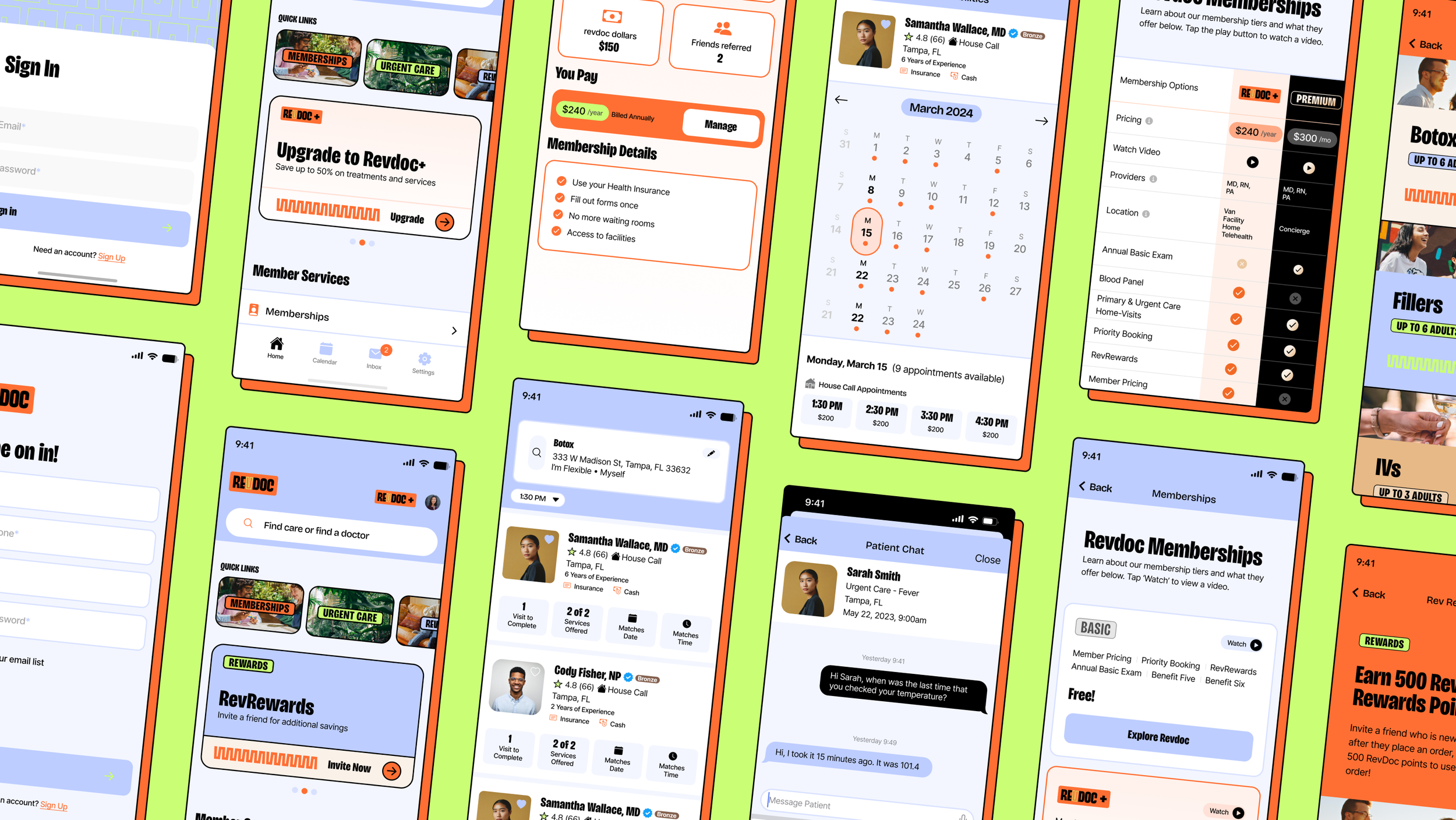


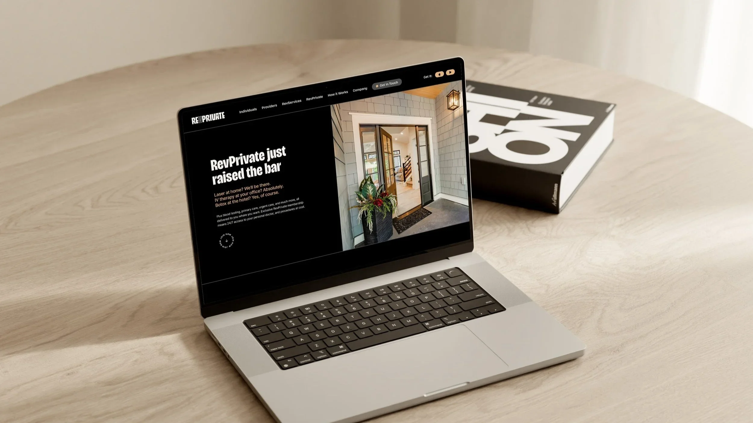
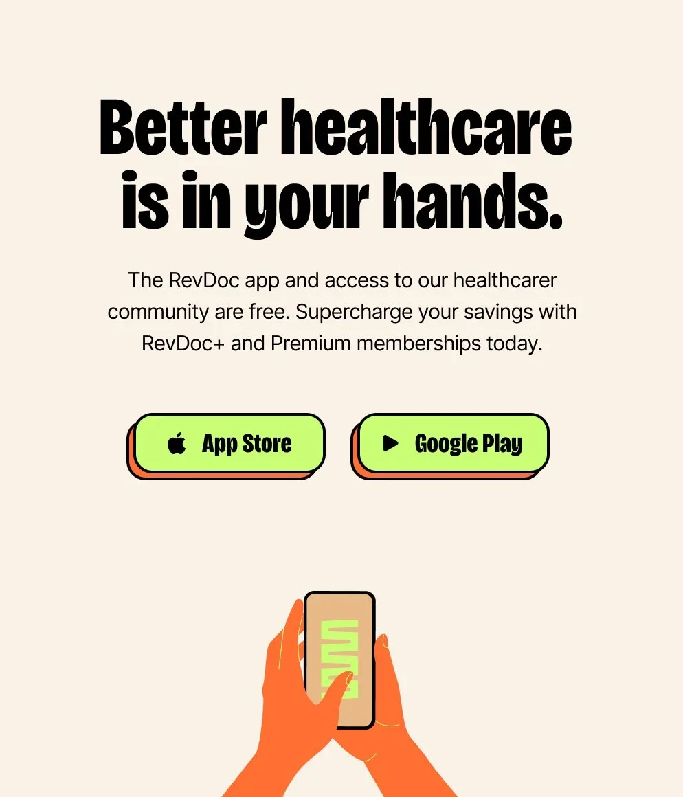
RevPrivate
RevDoc’s Premium Membership Program